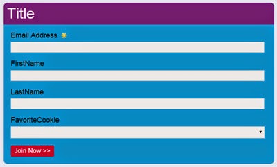
Are you missing out on potential customers or subscribers simply because you aren't asking for their email address?
Asking website visitors to subscribe is one of the easiest ways to grow your email file. Once the signup form is created it can operate on its own and doesn't require much ongoing attention.
Of course, there are some things to keep in mind during
initial setup. Things to consider include: information to collect, call to
action, form placement, and offers.
It’s a balancing act to determine what info to request on a
signup form. Consider what information will be most beneficial along with the
number of fields customers are likely to complete. The main goal of an signup
form is to collect email addresses, so it could be as simple as just one field.
To gather additional information, consider a progressive opt-in form. Progressive
opt-in forms break the sign up process into multiple pieces. Additional
information is requested after initial sign up to avoid abandoned subscription
forms.
 Call to action buttons are a critical part of the signup
form. They should capture visitor’s attention and compel them to perform an
action. There is no one size fits all solution. Test several options to
determine what works best. Consider, button color, wording, padding and size.
Consider asking for email addresses on every page of your
website. It’s relatively simple to accommodate a one line email subscription box.
It can also be used in conjunction with more detailed subscription forms in
some locations. If it’s too difficult to place a signup form on every page,
find the most visited pages and start there. For best results forms should be
placed above the fold (above the scroll).
Incentives encourage signup form completion. The incentive
could be a discount, but it doesn't have to be. Consider other offers, such as
access to information, a free trial, or a giveaway. It’s important to promptly give subscribers
their reward. A good rule of thumb is to include this information in the first
welcome email.
 |


